Photography Tutorials

Use and Control Colour to Elevate your Landscape Photography

Today we’re talking colour. Beautiful vibrant colour or even the complete lack of it. We’re going to look at how colour feeds into the entire photography process and how we can use and control that colour to improve our landscape photography.

Colour-4.jpg

Style

One of the first things to strike us when we first look at an image is the colour. This is particular true if the colour is designed to make a statement or the photographer has just made a complete hash of it, like some of those horrible HDR’s where it looks like you’ve just thrown up all over the page.

How you use colour in your landscape photography is an important part of what gives you your style. Do you prefer big vibrant colours? Do you use more muted tones? Are you a black and white person?

It doesn’t really matter and no one way is better than the other but what is happening with the colour in your image is something we need to think about and not just let it end up happening by chance.

So how do we start controlling the colour?

Colour-3.jpg

Planning

The first part comes right at the start during the planning phase. Photography is all about storytelling so when planning a shoot I will first decide what kind of story I want to tell. Colour has a big impact on story. Big vibrant saturated colours create a story of hope and happiness whilst more muted subtle, colours have a more thoughtful, down beat, artistic feeling. Colour is directly linked to our brains and affects our emotions heavily so as a photographer I want to use that to my benefit to take the viewer on an emotional journey.

The type of story I want to tell will then guide the location I choose to shoot in. The weather also has an impact on colour. Sometimes I will head out chasing a story. For example, I am in a happy mood and I want a big colour sunset type shot. I’ve checked the weather, I know there is a chance of a colourful sky, so I head to the beach. Finding a composition it then time to hope that the big sky comes. Sometimes it doesn’t pay off but often it will and the story be chased is told.

Sandsend-5.jpg

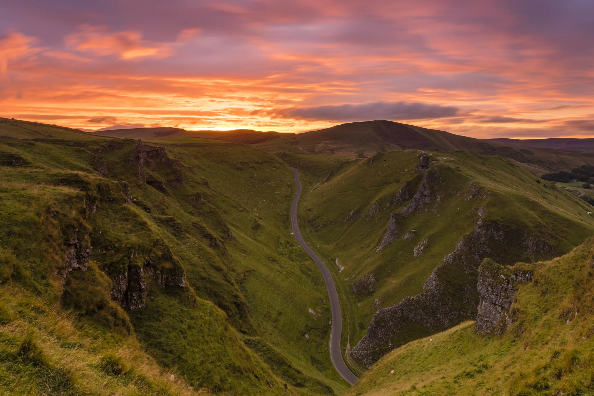
On other occasions I’m not in control of where the shoot is happening so it is necessary to adapt the story to the landscape and conditions. Thats exactly what happened in the Peak District last week. That location was set because I had plans with a friend. I knew the weather would be changeable and there was a good chance it would come good at the end of the day. I used colour in the images to drive the story of adverse weather from the desaturated drought shot, through the monochrome rain shot, to the black & white bleak, shot at the top before heading through the extreme clouds and into the sunny colourful sunset at the end.

Watch the video here - https://youtu.be/bsMlvi_RBxI

Compose with Colour

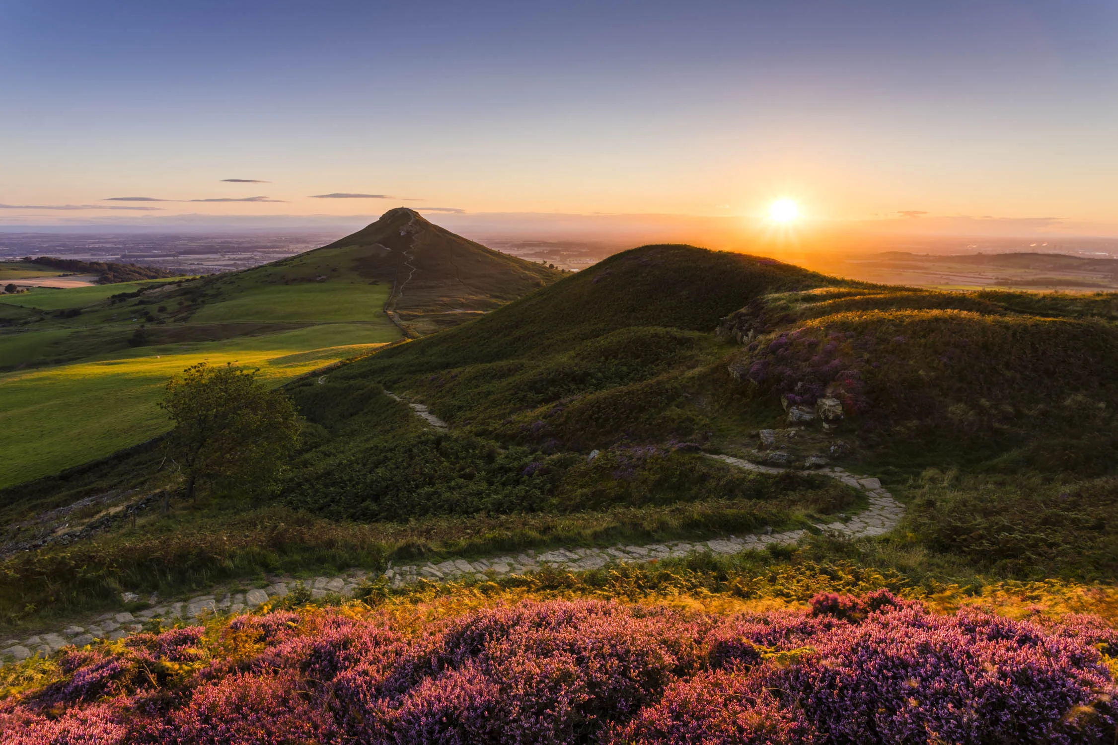
Placing some striking colour into an aspect of your composition can take a photograph from a good shot to a great shot. A blue sky compared to a big colourful sky is an obvious example and it is true of the foreground and mid ground too. Take British moorland as an example. It’s covered in heather and most of the year it is an uninteresting browny green colour. But every Autumn/September time it flowers and turns into a stunning and vibrant pinky purple colour that can turn a composition.

We can take this a step further by using good light. We all know about the golden hour but having the warm light hitting a scene will enhance the colour of everything, without creating nasty highlighted area that you can get during the middle day. This definitely happens with the heather but the same is true of rocks, sand, buildings, trees and pretty much everything else.

Colour-5.jpg

When good light is absent a scene will be much less vibrant, like in dull grey conditions. When I am faced with that I will often combine the more subtle colours with a long exposure to produce a more ethereal and fine art feel to the scene with muted colours or monochrome.

Colour-1.jpg

Black and White and Monochrome

Black and White is an interesting area of landscape photography. To get the best images it is really important to try and decide at the time of shooting if the final image should be black and white, rather than just using it in post to try an rescue a bad image. It does not mean the image need to be captured in Black and White, just have it in mind for the final composition.

Colour 22.jpg

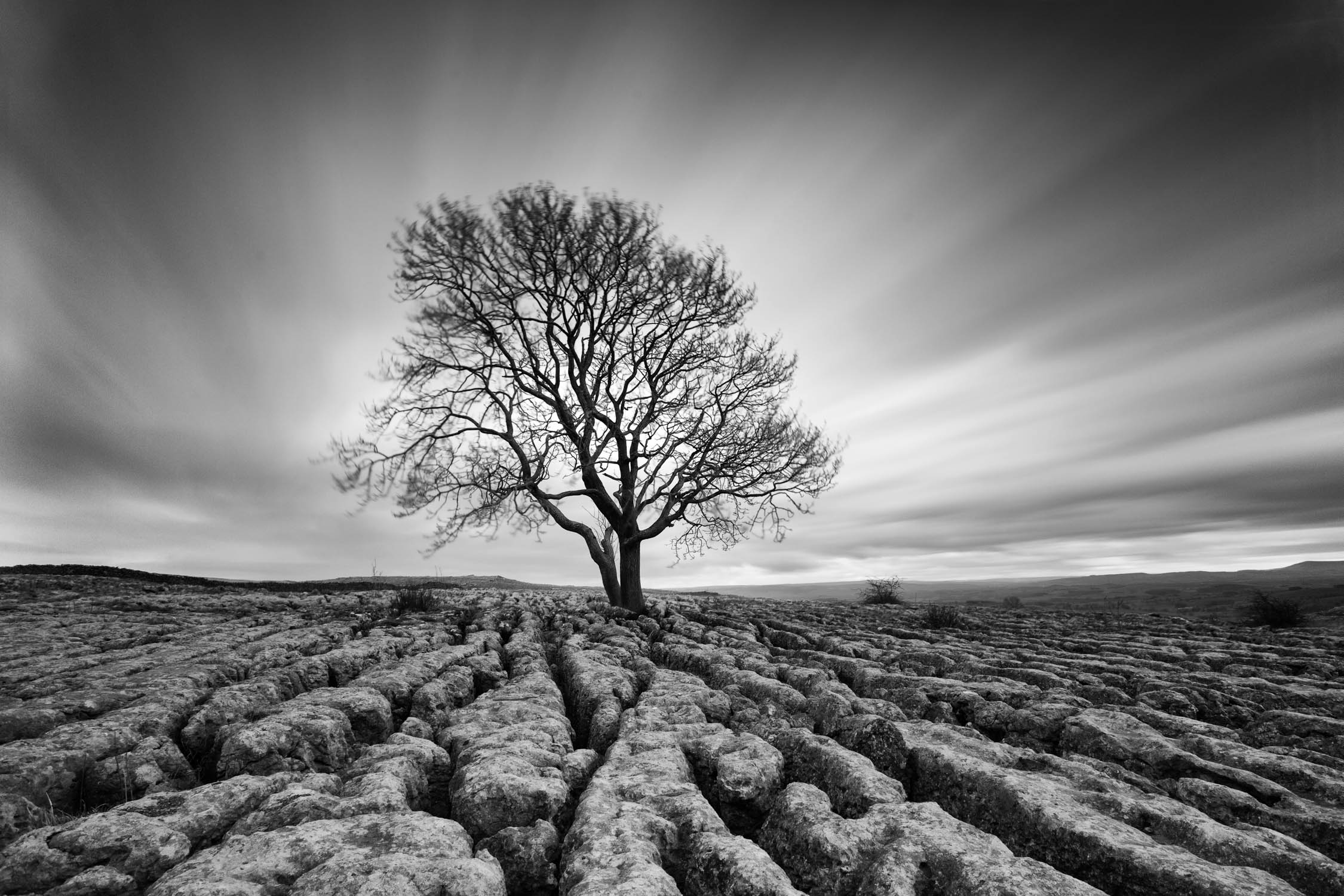
I use black and white when there is a really interesting composition but the colours are dull and actually detract from the image. Even in those dull colours, interesting tones are present that will work well in black and white. You can also post-process grey tones much more aggressively than a colour image to really add drama to a black and white photo.

A black and white image in monochrome but a monochrome image is not necessarily black and white. It just means we’re working with the varying tones of one colour. Monochrome images are difficult to plan for but it’s something I am massively attracted to when the conditions present themselves. Often it will happen in cloudy or foggy conditions. When the conditions present themselves it is good opportunity to create something a little more unique..

Colour-9.jpg

Post-processing

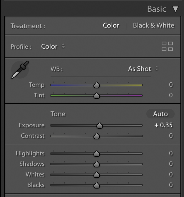
With Adobe Lightroom and other modern editors, they provide a massive amount of control over the colour. Several adjustments can be made to change the colour and transform an image.

White Balance

White balance is the first in the list. This is also the first time I have even considered white balance. When shooting in RAW white balance can be completely changed in post with no reduction in quality whatsoever. Setting the camera to auto white balance will be accurate most of the time and my method in post is to match the sight and feeling I had of the scene at the time.

Vibrance and Saturation

Vibrance and saturation both affect colour but in different ways. Saturation will change all of the colour in the image. It is a bit like the contrast slider in that it can be very tempting to add too much. A good tip is to dial it up to where you think it is right, then dial it back a bit to end up in the right place.

Vibrance on the other hand is smarter and only affects the middle colours so the changes are often more subtle. In the majority of my landscape images I add about 20 vibrance and 10 saturation and that gets me near to where I want to be.

HSL

Screen Shot 2018-08-12 at 15.36.04.png

The HSL panel gives control over hue, saturation and luminance. It gives massive control over colour in an image. It is through this that many of the presets out there are built around and it certainly creates the opportunity to make an image look unrealistic or stylised. I do not use this very often but it can be handy when you want to control individual colours. With a sunset boosting the overall saturation can take certain colours like orange and yellow overboard, so dialling those individual colours back in the HSL panel can balance the image back out. I try to keep things fairly natural so any changes I make in the HSL panel are mostly very subtle.

Grads and Brushes

Next we have software grads and brushes which give control over the colour in individual parts of the image. It can used especially to give control over the sky or the ground separately and is a very useful tool for colour.

NIK Collection

One bit of software I would massively recommend is the DxO NIK collection. It is collection of photo editing plugins that has changed hands now on a number of occassions. Silver Efex Pro is the pick of the bunch and is a way to convert and edit a black and white image. I don’t use it for every conversion but I think it’s worth it alone for the toners that mimic old dark room toners like selenium and sepia.

Printing

When it comes to printing we’re really just looking to control the colour as much as we possibly can so our prints look as much as possible like they do one screen. I have done a video on Printing before but three good tips here are:

  • Add about a 3rd of a stop exposure in Lightroom before you print. This extra brightness will help compensate for the fact there is no backlight on your paper and stop the image looking a bit dull when it comes out the printer.
  • Use the best paper you possibly can. This is particularly important for reproduction of saturated colours. Canson Premium High Gloss is the best I have found for this and holds more colour than pretty much any other paper I have tried.
  • Calibrate your monitor - I’m going to be making a video about this soon.
Colour 11-1-2.jpg

Conclusion

Thinking about colour throughout the landscape photography process will assist every aspect of what you are trying to achieve. This includes composition, exposure, perspective and many other things. Colour is something most of us are lucky enough to experience everyday so we can easily take it for granted. Using it carefully and intentionally however will see your photography elevate to the next level.

Editing Landscape Photography for Natural Results

Edit your landscape photos in natural way to make them shine like the scene you witnessed.

Get a FREE trial with Squarespace and 10% off - http://bit.ly/SquarespaceFirstMan

Follow First Man Photography for the latest updates:

Instagram - http://bit.ly/InstaFirstMan

My Gear - http://bit.ly/FirstManGear

Get a FREE trial of Adobe Lightroom CC and Photoshop - http://bit.ly/AdobeFirstMan

Landscape Photography Workshops - http://bit.ly/WorkshopsFirstMan

In this lightroom tutorial we go over several images to discuss how to edit your landscape photography images in a natural way. 


Best Lenses for Landscape Photography

We look at the best 3 lenses, their focal lengths and how they will help your landscape photography.

Today we are going to talk about the best lenses for landscape photography. There are not many surprises here, we’re talking about the holy trinity but I thought you’d find it useful if we talk about each lens and look at why and when we might use a particular lens and how that’s going to effect our landscape photography.

I am really keen for us all to start thinking about landscape as an art rather than a technical exercise and this is true with our lens choice too. The lens you choose for a particular image will tell the story differently so I think it’s important to understand why we are choosing a particular tool to create that narrative.

Wide Angle Canon 16-35mm f/4 IS

I chose this lens over the more expensive 2.8 because it’s still has great image quality, it’s lighter and it has IS which helps me for video. 

What this lets us do is to open up our field of vision and capture much more in the frame. It particularly lets us tell the story about relationship between the foreground and the background. This can be used creatively where we can get nice and close to our foreground and fill the compositions with it. A great example of this is rocks on a beach or a craggy mountain. When we do this be aware that the background will appear much smaller so a huge background is required. A sky full of colour or interesting clouds is perfect for seascapes or huge dominant mountains are also big enough to fill the background and look great. There are also times when you physically can’t move any further back and the wide angle still lets you get everything in…..caves are an example of this.

An important point to note, and something people often get wrong, it that focal length does not change perspective. A normal rectilinear wide angle lens does not cause perspective distortion. It increases the field of view but perspective is only controlled by the relationship between the camera itself and the subject.

There are two tests you can do to show this. Firstly set up an object and shoot it from a distance with both a wide angle lens and a telephoto. Crop into the wide angle shot so the object is the same size, and apart from a resolution loss, it will look the same. Now shoot the same object but make the object the same size in the frame for both shots. This time the perspective is wildly different and the images look completed different. This distortion in the wide angle shot is caused by the camera to subject distance, not by the wide angle. If it was the lens that caused the distortion then distant mountains would also appear distorted and they don’t.

Tamron 24-70mm

If I could only have one lens it would be definitely this one. This particular one is really decent, probably to the standard of the original Canon lens but the IS makes it great for video. Once Canon release a 2.8 version with IS then I will upgrade.

This focal range is just so useable and it’s why most kit lenses hit roughly this range. 24mm is plenty wide enough for the majority of occasions and 70mm can still get you in pretty close. It’s a perfect walk around lens for handheld shots and you’ll find yourself using the full focal range at some point or other. 

Not much more to say about this one. The focal length of our eyes fit into this range and I think most of us instinctively know what to do with this range.

Canon 70-200mm F/4

Canon has four lenses in this focal range so it can become quite confusing. This is the version without IS which I don’t need for landscapes and it is also relatively small and light. I use the 2.8 IS II when I shoot weddings……it’s probably my overall favourite lens but it’s just so damn heavy and completely impractical for landscape photography.

Now the 70-200mm range is really interesting for landscape photography. It lets us stand in front of a scene and really pull out the interesting elements. Get close in on the interesting light, the distant detail and essentially create a portrait of the landscape. It gives us control of the story too. When we are stood in a landscape, we see the whole thing with our eyes but it might just be the one distant element evoking the emotion in you. If you were to shoot this with a wide angle all the other irrelevant parts of the scene would enter the scene and distract the viewer from what you are trying to show them. You are the story teller and the viewer does not always need to know what is just out of the frame. Often a really good image would hint towards this anyway and spark the viewers imagination to fill in around the frame anyway.

There are also only so many amazing vistas in the world and we’re getting to the point now where they have all been shot in great light. This lens though gives us more room to be creative and capture something truly unique.

Start PRINTING your photos today | ESSENTIAL Tips and Tricks

Everything you need to know to start printing your photographs perfectly today! Whether you’re using a lab or you’re own printer I’ve got some tips to really help you out.

Printing your own pictures is a truly satisfying experience. It is the final step to creating an image and brings the work to life. I genuinely believe that photography is an art and when you print out a picture and hold it in your hand, it is difficult to argue that it is not. You can see and feel the amount of work that has gone into creating the image. It takes on a new life once you can physically hold it in your hand and becomes something special and meaningful.

Print.jpg

Imagine driving a great car. It is a decent experience. You drive around in it everyday and it is enjoyable and satisfying. Some people notice you, others do not. It is just like leaving your images in digital format. But every now and again, when the sun comes out, you take a drive down an awesome coastal road, beautiful girl/boy next to you, rolling with the top down; it is an absolutely magical experience and everyone takes note. That is the kind of feeling printing your work can invoke. It’s similar to the the normal process but also vastly more enjoyable and fulfilling.

With that picture in your mind, if you have not printed your work before, you really must. So how do we do it? To reproduce images accurately there’s a few steps to follow before we go ahead and print. This applies to whether printing using a lab or printing at home and will help to avoid being disappointed with the final results.

Brightness Adjustment

Screen Shot 2018-05-21 at 10.03.10.png

Assuming Lightroom is the editing weapon of choice, (other editors are very similar) the first thing to do is create a virtual copy of the image. This acts as a print file without upsetting the original edit. Looking at images on a screen, the perfectly backlit monitor adds brightness to the image, even with a calibrated monitor, which creates and evenly illuminated picture. Once printed, the image is front lit and room light can be inconsistent and the image is at risk of looking dull. This can be compensated for by increasing the exposure by about a third to half a stop. Not too much to blow out the highlights, but just enough to give the brightness a little boost and avoid disappointment.

Lab Vs DIY

Having your own good quality photo printer is a very nice thing. I have been using the Canon Pro 10s which prints up to A3+ size. It produces prints that are equal to the quality of a lab and the results are exceptional. Cost is an issue though with replaceables like paper and ink and the upfront cost of the printer also needs to be taken into account. It is a personal decision for each photographer but you will probably ‘know’ when the time is right.

A lab can often work out cheaper if your printing is sporadic. Labs are also more versatile in terms of the size of print, the material you can print on and you can easily try out different papers. The downside is the lack of control. Results can often be disappointing and colour not accurate. Taking shipping or visits to the premises into account, time is also a factor and it takes longer to get the print in hand.

Exporting

Printing at home is easy because we can print directly from Lightroom using the print module. The higher end Canon printers also come with Canon Print Studio Pro. This Lightroom plugin gives ultimate control over your prints and is designed to work with those specific printers.

Screen Shot 2018-05-21 at 10.10.13.png

The lab will not be able to read a raw file so the photo will need to be exported as an image file. Most good labs accept a wide range of file types to provide ultimate versatility to customers. However, to get best quality, the preferable file format to use is a TIFF file. These are uncompressed so no information is lost like it is with a JPEG. The file size will be much bigger but the results will also be more accurate.

Colour Accuracy

Accurate colour is important because we want our images to print out to match how they were edited on the screen. A beautiful orange and pink sunset will be ruined with a print containing a nasty green tinge. There is a lot happening to go from screen to paper, so we must use ICC profiles to make it easy. ICC profiles are plugins for photo editors that are based on the type of printer being used and the type of paper we choose. Once installed into software such as Lightroom we can enable soft proofing in the develop module, select the paper being used, and the ICC profile will simulate how the print will look on paper. Adjustments can then be made as required prior to print. Good labs should all provide ICC profiles by way of a free download. When printing at home, paper companies also provide them for your printer model.

Paper Type

Print 4.jpg

Generally there are three kinds of paper:

  • Glossy
  • Semi Gloss
  • Matt

The type and quality of the paper being used can massively affect the final print. It is very much a subjective thing and something that requires personal experimentation. As a general rule though I use a glossy finish for images that are heavily saturated and colourful. The glossy finish helps the colours pop and it works perfectly for the water drop images I create and gives them extra impact. 

Semi Gloss - I think is my favourite. I have been using Canson Baryta for years and it’s just a magnificent paper. It feels and looks extremely professional and the high quality paper works extremely well on a wide range of images. The majority of landscape prints I sell are printed on this.

Print-3.jpg

Matt or Rag paper - Good cotton rag paper is the best bet for a matt finish. Good rag papers will have a high DMax rating which means they hold the blacks very well. Rag papers are perfect for black and white images because it holds really strong contrast. They are also great for certain landscapes and colour portraits when a more muted fine art feel is required.

Borders

Print-2.jpg

Many photographers like to have a white border around the edge of their print. My preference though is to  print borderless whenever possible. Borderless printing maximises the size of the print and once it is in a frame, with a mount, the overall work has a border but also maximise the size of the paper. A border can be useful though. It lets you put a footnote on the print, makes it easier to handle and some people prefer the double border in the frame. Some printers also do not print borderless with certain types of paper like heavy rag paper and also when using a custom paper size. A border also makes it easier to attach to the mount. 

Printing is an in-depth topic and much of it is subjective. The best thing to do is to start printing and experiment for yourself. One things is for certain, you will not regret it once you are holding your physical work in hand.

You can also head over to store check out all the prints I have for sale. I would be honoured if you choose to buy one and it also helps me keep the lights on.

The Essential Workflow to Backup Your Photos, Videos and Digital Life

Backing up your files is a hugely necessary and sometimes frustrating step in your photography and video workflow. I show you my backup solution that keeps me moving forwards and all my files safe.

Get a FREE trial with Squarespace and 10% off your first order - http://www.squarespace.com/firstman

Firstly as a basic theory you always want to have two copies of your files. Drives fail, data corrupts and if you only have one copy you are vulnerable.

So from the start, I’m out in the field and I am photographing, filming and creating my content. With some cameras the backup starts straight away with dual cards. With cameras like the Canon 800D or a drone they only have one card slot so as soon as that picture or footage is captured I’m vulnerable.  I want to move onto the next step as soon as possible.

I get home or back to where I’m staying and I want to dump the cards as soon as possible and transfer the files to the computer. Laptops now don’t have massive storage capacity so if I’m travelling I’ll take something like an SSD to copy the files to. I can now relax a bit because I have two copies, on the computer and on the cards.

I will then generally try to edit my footage or images from the internal SSD of my laptop because it’s faster. After that it’s then time to transfer the files to the main external hard drive or server. Until very recently I was using using a 5TB drive. It’s decent but it’s one drive and it’s slow compared to an SSD which makes re-edits unpleasant to do to and slow.

So I’ve recently upgraded to this the Drobo 5D3. This uses a kind of RAID 5 which increases speed because it’s writing data to all the drives at the same time and also gives you redundancy. If one drive fails I can just pull it out and pop in another and my data is safe. This one is thunderbolt 3 so it’s also nice and fast and you can actually edit 4K footage straight off this. In the Drobo I’ve got three 10TB seagate drives which gives me 18TB of storage with that redundancy. This is pretty expensive and that’s where the pain comes. All this time and money spent is not glamorous but you need to spend it to keep your files safe.

Now the next step is to backup all this on a separate drive to again give us that redundancy with two copies. You can use Time Machine or Acronis to do this and you even need to do it with a RAID system like the Drobo. If the Drobo unit itself fails, then your data is gone. At the moment I am using an 8TB seagate drive and I’ve copied all previous years work to separate external drives.

I then back all this up again using the cloud. Offsite backup is important in a case of fire or theft. I am currently using Backblaze which is a kind of set it and forget system that you get for a small monthly fee and you can back up and restore your files. You can access them online like Google drive or dropbox. I’ll put a link down below for you to check that out and you can store unlimited data and that includes external HD’s. 

Now the last step with your photos that we don't immediately think of is to print them. There is a theory blowing around that modern human history and knowledge is currently at massive risk because it is all stored digitally. Printing your pictures guards against this and it also just an extremely satisfying thing to do anyway. 

Backup Flow Chart.jpg

I created this diagram a little while ago to show my backup workflow so feel free to screen shot it and use it as a reference. Please also share this video with someone who needs to hear the backup message.

Out.

Ramp Up Your Sunset Photography with this Easy Technique

We use a very simple technique and a bit of layer masking to take your sunset landscape photography to the next level. 

Get a FREE trial with Squarespace and 10% off your first order - http://www.squarespace.com/firstman

Get a FREE trial of Adobe Lightroom CC and Photoshop - https://goo.gl/YznzDv

In this landscape photography tutorial I show you an amazingly simple technique to ramp up the quality of your sunset photographs when you are shooting straight at the sun.

Water Drops-3.jpg

There are two difficulties when shooting directly at the sun that we need to overcome. First is the exposure difference between the sky and the ground. The sky is almost always brighter than the ground so we must take action to balance the exposure across the frame. This is easy to solve and we have a choice of two different methods.

We can use either ND Grad filters, that darken the sky at the point of shooting, or use bracketing. This is where we combine images of the same scene with different exposures to have well exposed highlights,  mid tones and shadows. The video tutorial below gives details of how to do bracketing when doing sunset photography.

https://youtu.be/ndoolGymQJM

The second problem is dealing with lens flare. Those nasty, ever expanding rings that enter your image and ruin the shot. They can be avoided by not shooting at the sun, keeping the sun to your side or using your hand or a lens hood to block it. Sometimes that is not possible or the composition necessitates pointing toward the sun. Thankfully there is very simply technique that anyone can apply, with any camera, as long as a tripod is employed.

Water Drops-6.jpg

The trick is to very simply place your finger in front of the lens and block out the sun with your finger. We take at least two shots, keeping the camera perfectly still, to expose once for the ground and once for the sky. When exposing for the ground just pop your finger between the sun and the lens and it removes the flare. In the video I show how to then combine the two images using Adobe Lightroom and Photoshop with simple masking.

Water Drops.jpg

It is an easy technique and will work in many situations. On some occasions some additional luminosity masking can help balance the exposure if there is a big difference between the ground and the sky. Luminosity masking is a subject for another day and I only mention it briefly in this video.

One small safety point. When you are shooting straight at the sun do not look at it directly through  the viewfinder as it can damage your eyes. It is much safer using live view and this will not damage the sensor of the camera if only done occasionally.

Water Drops-4.jpg

The on location section of this video is an extract from landscape photography settings tutorial.

https://youtu.be/0uhG0HvjXGw

Adobe make BIG Lightroom CC changes!!

What is the difference between Adobe Lightroom Classic CC and Adobe Lightroom CC? In this video we discuss some of the big changes that have been made by Adobe this week that is causing many photographers to be nervous.

Get a FREE trial of Adobe Lightroom CC and Photoshop - https://goo.gl/YznzDv

Follow First Man Photography for the latest updates:

Adobe Lightroom Changes

Adobe Lightroom has gone through some big changes in the last few days. It’s a staple of millions of photographers worldwide and changes like this can make many of us nervous. In this video I’m gonna go through some of the changes, discuss how it might affect everyone, from the absolute beginner to the seasoned pro and share a couple of my thoughts. 

On Wednesday Adobe updated their full suite of apps and some of the biggest changes involved Lightroom. For years it has been the main software used by photographers all over the world. Prior to this week it hadn’t been updated since 2015 and has been plagued with slow speeds and has become increasingly complicated. 

Problem Solving Approach

Adobe have now tried to solve these problems by splitting Lightroom into two parts. Lightroom CC and Lightroom Classic CC. These names have caused some confusion.  Adobe Lightroom Classic is pretty much the same program we have always known and has been updated with new features like luminosity masking and much needed performance improvements. Lightroom CC is now a stripped back version of Lightroom that is cloud based. It is basic but powerful. It still edits raw files but works seamlessly across all your devices including your desktop and even a web browser. 

This has been much needed. Recently on my workshops I have come across photographers who are new to photography or just getting back into it after years of being away and the essential step of post processing is something that has been intimidating and difficult to learn. With Lightroom CC we can now make all the most straightforward edits without the complexity and still shoot in raw. The files and the edits are stored in the cloud so there is no need to try and manage all your files on an ageing computer. They can be made on your iPad, phone or other devices with the Adobe servers doing the hard work. 

More User Friendly?

The interface has been reworked to be more easily understandable and user friendly. The app imports all your cloud based collections from your current Lightroom mobile account. You can load in new files and edit them like normal. I can see this being useful even for seasoned shooters. One way I can see me using this is for simple family pictures, quick shoots or even weddings. I will load in the raw images into Lightroom Classic, select the keepers and place them into a collection and the come over to Lightroom CC where I can use any of my devices as suits me to make the simple edits required for these type of shots. I can still open them into photoshop from the desktop version of Lightroom CC. If need to make more complex images like bracketed shots or combine panoramas then I can move back into Lightroom Classic.

Cost

From the start of next year all Lightroom products will now be subscription based. The basic package is the Lightroom CC package.  This includes Lightroom CC and 1TB of cloud storage for £$10 per month. Next is the photography package. This includes Lightroom CC, Lightroom CC classic, Photoshop and 20gb of cloud storage. The final package is the same as the photography plan but with 1TB of storage and costs £$20 per month. 

Photographer Nerves

Understandably there has been some nervousness and confusion about the changes Adobe have made here. They are clearly targeting the 95% percent of the world who have previously been happy to never edit their images.  It makes the rest of us worry that we are going to be neglected. I don’t think that will be the case though. I think Adobe could have done a better job just by naming things a little differently. Adobe Lightroom CC and Adobe Lightroom Pro CC would have been much more descriptive and made us traditional Lightroom users feel special, rather than old and out of date. 

How to Do Mirror Photography to Capture a Next Level Selfie

Mirror-Photography-Blog-Cover.jpg

Take your selfies to the next level using mirror photography.

Photography in it's purest form often has a reputation for being very serious and stuffy. This is not always underserved given the behaviour of some photographers and the exclusive nature of the art world generally. Whilst I am super serious about my work, I also want it to be fun. I want to have fun doing it and sometimes I want the images themselves to be fun. There is no harm in this and a creating a interesting selfie using mirror photography fits the bill nicely.

In the video we go through how to shoot mirror photography and create an interesting and fun selfie. The video covers how to shoot the shot and then takes you through the relatively easy edit in Lightroom and Photoshop.

To get a FREE trail of Photoshop and Lightroom click the link below.

https://www.firstmanphotography.com/get/photography-plan

Shooting fun photography can be technically challenging and will teach you a lot. Learning the processes involved in capturing images like this mirror photography shot, can help you take your skills to the next level. Selfies have become the domain of smart phones but a good selfie will really make your work stand out from the crowd.

You can use the mirror photography techniques we go through in this video in a variety of situations and really let your imagination run wild. Imagine taking a full length mirror out into the woods and creating an effect where it appears you have stumbled upon the doorway to another dimension. It does not have to be a self portrait either. Employ a friend, a model or anyone else to feature in you image and you will have a lot of fun shooting it.

Using mirrors in your photography can work at other times too. For example, shooting the reflection of a bride getting ready for her wedding can add an element of creativity to a moment that is often shot in a relatively dull setting like a hotel room or living room. Just think about where you want your camera to focus. Sometimes you may want the reflection in focus and sometimes the subject themselves. These creative images will always lead to your work being noticed and, for most of us, grabbing the attention of the viewer is what we are aiming to achieve.

reflection photography

Whether you use mirror photography to shoot a creative selfie, add interest to an otherwise standard shot or use it as the theme to a photography project it is entirely up to you. Give it a go and let your creative juices run wild.

Subscribe to the channel. Videos go up on a Wednesday and a Sunday.

Other videos mentioned:

https://www.firstmanphotography.com/blog/5-reasons-photography-project

https://www.firstmanphotography.com/tutorials/how-to-remove-spots-in-photoshop

Photoshop Layers Tutorial

Photoshop-Layers-Video-Cover.jpg

Photoshop layers provide the keys to the photo editing kingdom.

In this video we give you an introduction to layers in photoshop and how they work.

If you have ever tried, or looked into, using Adobe Photoshop before you have probably heard of photoshop layers. Being central to how Photoshop is used it is vitally important to understand what layers are and how they work.

The first thing to understand is that layers are transparent. However when you open an image into Photoshop it will be placed onto the background layer. Likewise if you create a new document the background will be filled with white by default.

layers in photoshop

When you click to create a new layer it will be transparent and sit on top (or in front of) the background layer until you add elements to it, such as text, shapes or other images. A photoshop document can contain numerous layers with the layer at the top of the list being visible before any others beneath it and so on. This means any element in a layer will obscure anything in the layers below (unless the opacity is reduced). In many circumstances this will be a desired effect as you aim to cover or replace the main image below, for example when adding a logo or some text to an image.

Things get more complicated once we start adding adjustment layers and masks but photoshop layers provide a high level of control whilst being non-destructive. Edits and changes occur on layers above our main image leaving the main image unaffected. This means changes are reversible if we make a mistake with an edit or your vision changes at a later date.

Photoshop layers can be dragged within the layer panel to adjust the order. They can also be made invisible by clicking the eye icon. This is very useful to assess the effectiveness of a particular edit or temporarily hide the effects of the layer from your image.

Depending on the file type you choose to save your images with, e.g. .psd, layer information will also be saved so edits and layers can be revisited at a later date.

It is important to understand photoshop layers and how they work and much of what photoshop can do is built around the principle of layers. Once understood using Photoshop will feel much more natural and a lot less intimidating.

Follow me on Instagram - http://instagram.com/adamkarnacz