Today we’re talking colour. Beautiful vibrant colour or even the complete lack of it. We’re going to look at how colour feeds into the entire photography process and how we can use and control that colour to improve our landscape photography.
Style
One of the first things to strike us when we first look at an image is the colour. This is particular true if the colour is designed to make a statement or the photographer has just made a complete hash of it, like some of those horrible HDR’s where it looks like you’ve just thrown up all over the page.
How you use colour in your landscape photography is an important part of what gives you your style. Do you prefer big vibrant colours? Do you use more muted tones? Are you a black and white person?
It doesn’t really matter and no one way is better than the other but what is happening with the colour in your image is something we need to think about and not just let it end up happening by chance.
So how do we start controlling the colour?
Planning
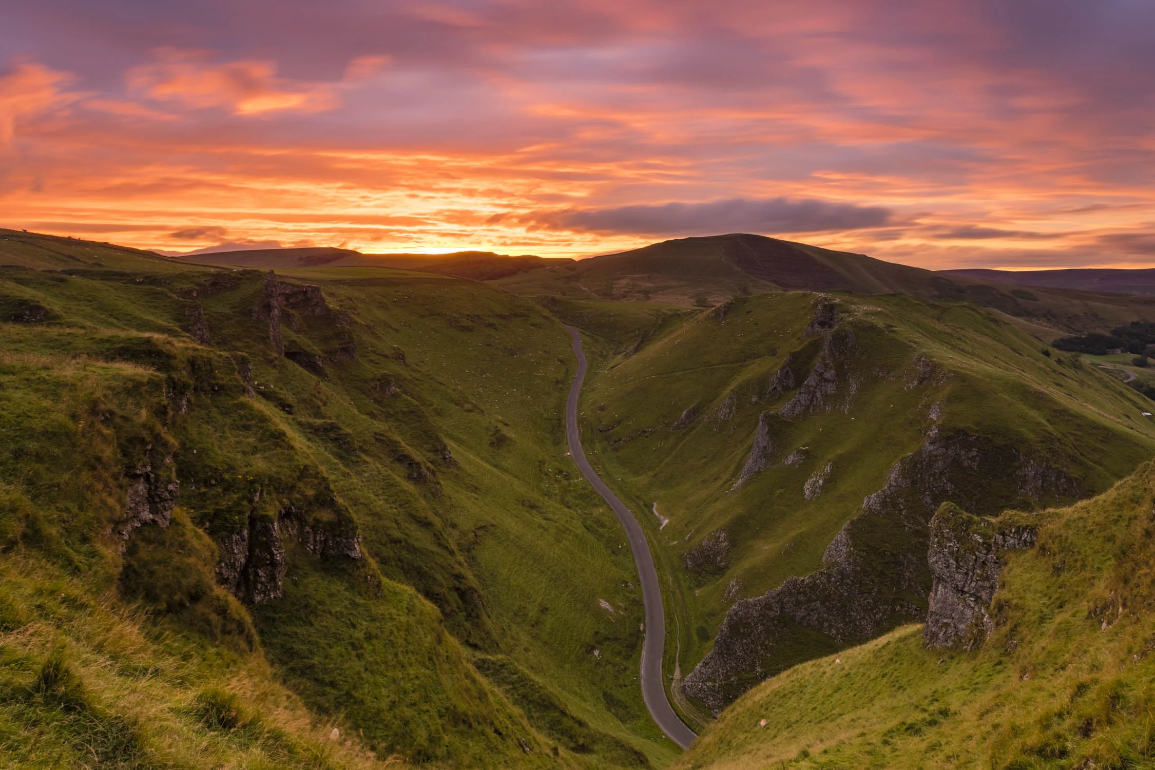
The first part comes right at the start during the planning phase. Photography is all about storytelling so when planning a shoot I will first decide what kind of story I want to tell. Colour has a big impact on story. Big vibrant saturated colours create a story of hope and happiness whilst more muted subtle, colours have a more thoughtful, down beat, artistic feeling. Colour is directly linked to our brains and affects our emotions heavily so as a photographer I want to use that to my benefit to take the viewer on an emotional journey.
The type of story I want to tell will then guide the location I choose to shoot in. The weather also has an impact on colour. Sometimes I will head out chasing a story. For example, I am in a happy mood and I want a big colour sunset type shot. I’ve checked the weather, I know there is a chance of a colourful sky, so I head to the beach. Finding a composition it then time to hope that the big sky comes. Sometimes it doesn’t pay off but often it will and the story be chased is told.
On other occasions I’m not in control of where the shoot is happening so it is necessary to adapt the story to the landscape and conditions. Thats exactly what happened in the Peak District last week. That location was set because I had plans with a friend. I knew the weather would be changeable and there was a good chance it would come good at the end of the day. I used colour in the images to drive the story of adverse weather from the desaturated drought shot, through the monochrome rain shot, to the black & white bleak, shot at the top before heading through the extreme clouds and into the sunny colourful sunset at the end.
Watch the video here - https://youtu.be/bsMlvi_RBxI
Compose with Colour
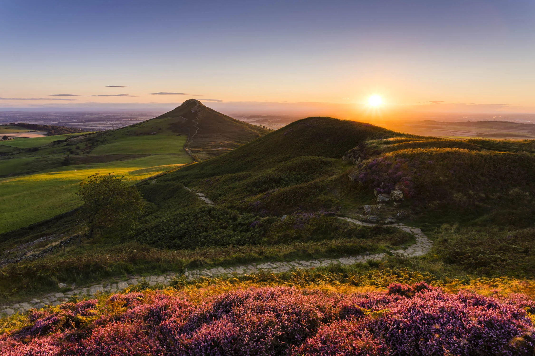
Placing some striking colour into an aspect of your composition can take a photograph from a good shot to a great shot. A blue sky compared to a big colourful sky is an obvious example and it is true of the foreground and mid ground too. Take British moorland as an example. It’s covered in heather and most of the year it is an uninteresting browny green colour. But every Autumn/September time it flowers and turns into a stunning and vibrant pinky purple colour that can turn a composition.
We can take this a step further by using good light. We all know about the golden hour but having the warm light hitting a scene will enhance the colour of everything, without creating nasty highlighted area that you can get during the middle day. This definitely happens with the heather but the same is true of rocks, sand, buildings, trees and pretty much everything else.
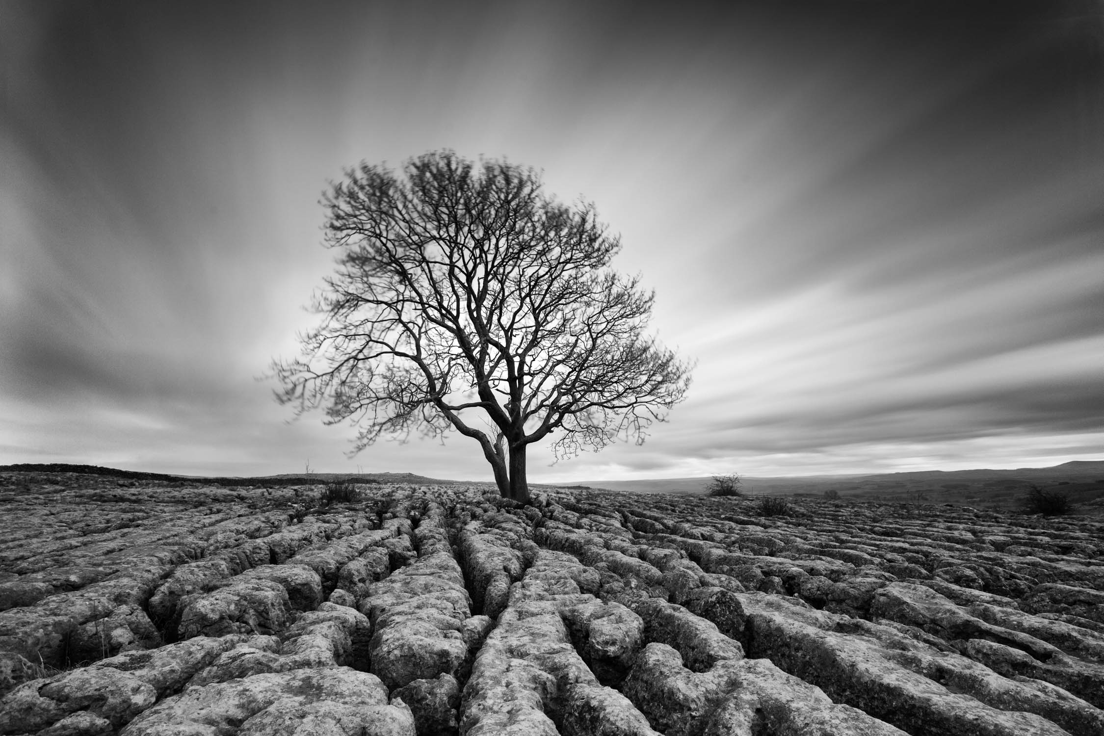
When good light is absent a scene will be much less vibrant, like in dull grey conditions. When I am faced with that I will often combine the more subtle colours with a long exposure to produce a more ethereal and fine art feel to the scene with muted colours or monochrome.
Black and White and Monochrome
Black and White is an interesting area of landscape photography. To get the best images it is really important to try and decide at the time of shooting if the final image should be black and white, rather than just using it in post to try an rescue a bad image. It does not mean the image need to be captured in Black and White, just have it in mind for the final composition.
I use black and white when there is a really interesting composition but the colours are dull and actually detract from the image. Even in those dull colours, interesting tones are present that will work well in black and white. You can also post-process grey tones much more aggressively than a colour image to really add drama to a black and white photo.
A black and white image in monochrome but a monochrome image is not necessarily black and white. It just means we’re working with the varying tones of one colour. Monochrome images are difficult to plan for but it’s something I am massively attracted to when the conditions present themselves. Often it will happen in cloudy or foggy conditions. When the conditions present themselves it is good opportunity to create something a little more unique..
Post-processing
With Adobe Lightroom and other modern editors, they provide a massive amount of control over the colour. Several adjustments can be made to change the colour and transform an image.
White Balance
White balance is the first in the list. This is also the first time I have even considered white balance. When shooting in RAW white balance can be completely changed in post with no reduction in quality whatsoever. Setting the camera to auto white balance will be accurate most of the time and my method in post is to match the sight and feeling I had of the scene at the time.
Vibrance and Saturation
Vibrance and saturation both affect colour but in different ways. Saturation will change all of the colour in the image. It is a bit like the contrast slider in that it can be very tempting to add too much. A good tip is to dial it up to where you think it is right, then dial it back a bit to end up in the right place.
Vibrance on the other hand is smarter and only affects the middle colours so the changes are often more subtle. In the majority of my landscape images I add about 20 vibrance and 10 saturation and that gets me near to where I want to be.
HSL
The HSL panel gives control over hue, saturation and luminance. It gives massive control over colour in an image. It is through this that many of the presets out there are built around and it certainly creates the opportunity to make an image look unrealistic or stylised. I do not use this very often but it can be handy when you want to control individual colours. With a sunset boosting the overall saturation can take certain colours like orange and yellow overboard, so dialling those individual colours back in the HSL panel can balance the image back out. I try to keep things fairly natural so any changes I make in the HSL panel are mostly very subtle.
Grads and Brushes
Next we have software grads and brushes which give control over the colour in individual parts of the image. It can used especially to give control over the sky or the ground separately and is a very useful tool for colour.
NIK Collection
One bit of software I would massively recommend is the DxO NIK collection. It is collection of photo editing plugins that has changed hands now on a number of occassions. Silver Efex Pro is the pick of the bunch and is a way to convert and edit a black and white image. I don’t use it for every conversion but I think it’s worth it alone for the toners that mimic old dark room toners like selenium and sepia.
Printing
When it comes to printing we’re really just looking to control the colour as much as we possibly can so our prints look as much as possible like they do one screen. I have done a video on Printing before but three good tips here are:
- Add about a 3rd of a stop exposure in Lightroom before you print. This extra brightness will help compensate for the fact there is no backlight on your paper and stop the image looking a bit dull when it comes out the printer.
- Use the best paper you possibly can. This is particularly important for reproduction of saturated colours. Canson Premium High Gloss is the best I have found for this and holds more colour than pretty much any other paper I have tried.
- Calibrate your monitor - I’m going to be making a video about this soon.
Conclusion
Thinking about colour throughout the landscape photography process will assist every aspect of what you are trying to achieve. This includes composition, exposure, perspective and many other things. Colour is something most of us are lucky enough to experience everyday so we can easily take it for granted. Using it carefully and intentionally however will see your photography elevate to the next level.


